In May 2019, I had no idea what content design was.
I was interviewing for a copywriting job, and the hiring manager asked me if I had experience writing for digital products — things like error messages, headlines, calls-to-action.
I had done some of that here and there in my previous role at Tinder, so I said, “Sure I do.” And I’m so glad I did.
Fast-forward to 2022, I’ve penned microcopy at companies like Netflix, Fitbit, Afterpay, and many more, and I firmly believe content design is the writing of the future 🪐
That said, when I was starting out, I wished I had someone sit me down and give me the scoop of what content design is in straight-shooting real-talk. There were books and articles, but it all felt so technical.
So, this is my “what is content design” sit-down to my former self and anyone trying to break into content design who can’t quite wrap their head around it.
Let’s dive in…
I’m guessing you started this lesson either feeling super pumped to dive in full force, or you’re feeling anxious to pieces because you feel like you’re basically taking on a whole new language. Or maybe you’re feeling a mix of both.
Well, I want to start off by saying, while content design might be a different way of thinking than you’re used to, you're already a content designer.
Content design is everywhere, and just because it’s not inside a product, it’s still the basics of user experiences (or UX.)
For example, have you ever seen one of these bad boys?
It’s a horrible, horrible experience, and you’re destined to get a parking ticket.
Now, how’s this?
I’m guessing it’s clear to you in a glance when you can and can’t park (shout out to Nikki Sylianteng, the interaction designer who designed this masterpiece.)
You know this version is better. And I bet you can even explain why.
If you need a little inspiration, here’s why I feel the second parking sign is better:
Someone can look at the second parking sign and understand if they can park there in a glance. The first parking sign can take a full hour to unpack. By clarifying the actual parking rules in a glanceable format, the second parking sign requires less thinking, making someone’s life easier and less stressful.
Someone looking for a parking spot isn’t really interested in understanding a parking sign. They might be late to an appointment or in a rush, and the stress of getting a parking ticket is the cherry on top to a stress-packed day. The first parking sign exhibits the city designing an easy experience for them to execute. The second parking sign selflessly helps someone — regardless of their capabilities — accomplish their goal with ease, empathy, and equality.
The second parking sign is more helpful because it:
- Answers any and all questions that could come up
- Surfaces the right information at the right time
- Uncovers what context is *actually* helpful
- Translates the value of facts for the user
Content design isn’t magic, and it doesn’t require you to be a “natural writer.” As a starting point, all you need is a sense for what makes pleasant experiences. And you can use your own life as a gut-check for that.
Content design is about creating clear experiences in digital products by, really, just having deep empathy for other people. It’s something that can easily be learned, and with intentional practice, creating “good” content design can quickly become second nature.
If you want to advocate for people who can’t speak for themselves while making the world a simpler place, you have what it takes to thrive as a content designer — I’m just gonna walk you through the nitty-gritty.
What is content design, as told by an ill-fitting coffee cup
It's time to officially dive into what content design is.
Before getting into the technical nitty-gritty, let’s start with an analogy every hot-liquid drinker can most likely relate to…
Have you ever put a lid on a coffee cup that doesn’t fit quite right? Like this 👇
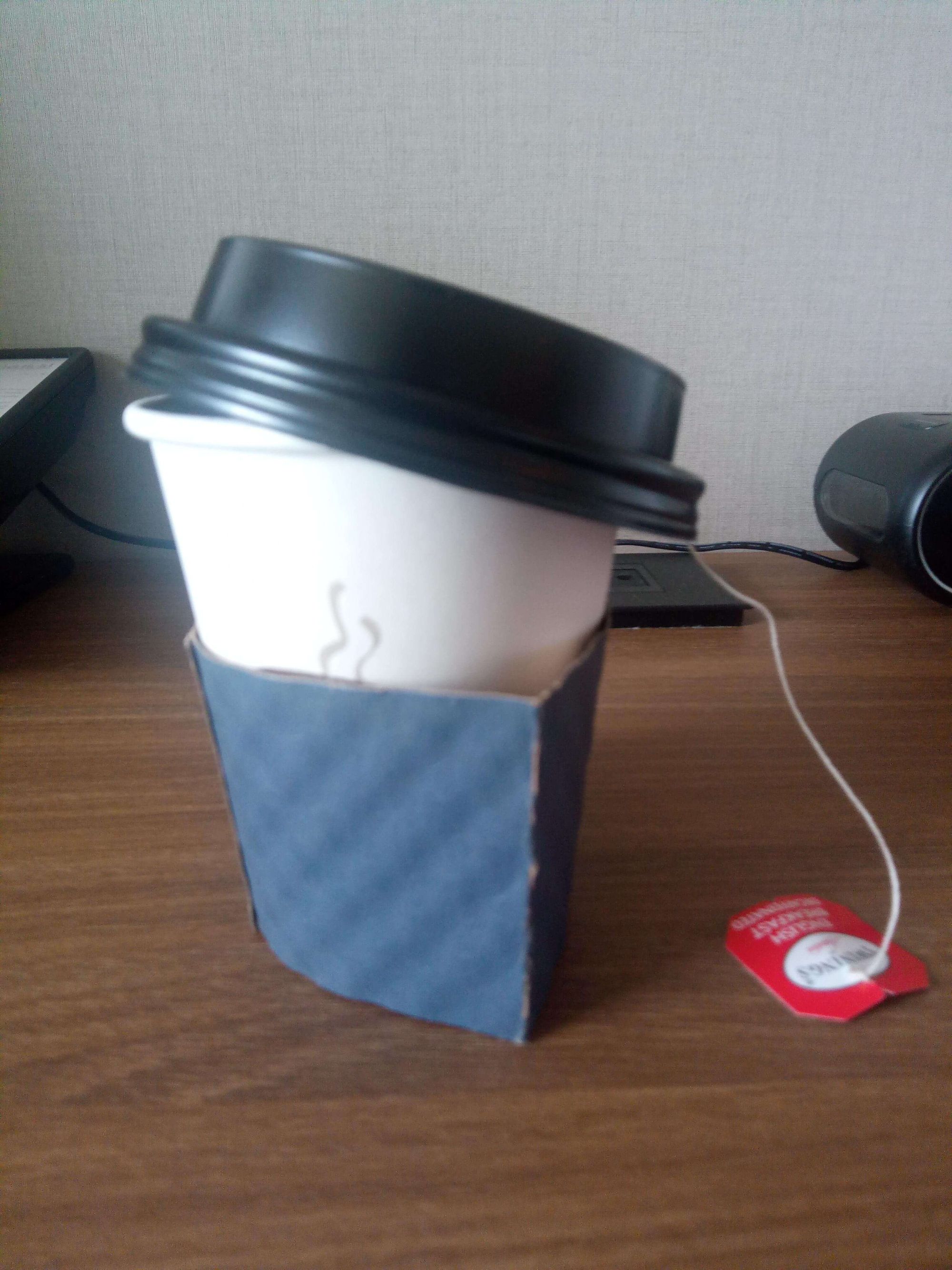
It doesn’t go on smoothly, and you have to make it work.
Filling in the blanks, or using words thoughtlessly, is like that — you can get the words to make sense (or you can squish the lid on the coffee cup,) but it’s not perfect, and you’re making compromises.
Content design is like being able to design the lid and the coffee cup it goes on. With that level of involvement and control, you can make sure it’s a smooth experience.
Applying this to products, think back to the last time you were super confused by what to do when using an app. Maybe it was unclear hitting a button processed your payment, or maybe you weren’t sure if you were signing up for something by hitting continue. You hesitated to move forward, and maybe you didn’t.
That’s products without content design: They can be hard to understand, they’re less helpful, less usable, and less accessible to everyone.
When content design comes in, attention is paid to both the words and the structure they’re laid out in. With that combination and level of attention, the unclear button changes from “Continue” to “Pay now,” and a questionable screen gains a “Subscribe to our weekly newsletter” checkbox.
We’ll go over plenty of examples of content design shortly. But before we do, let’s dive into a more technical definition of content design…
Let’s get technical: What is content design?
Technically speaking, a content designer is a designer who uses words to design helpful, usable, and informative product experiences to create a conversation between the product and the user.
A content designer focuses on activities like storytelling, writing, editing, content hierarchy, and information architecture in parallel with a product designer.
Why a content designer is a designer
While content designer work with words, we use them more like puzzle pieces or building blocks than to form paragraphs.
Instead of explaining a concept in a string of sentences, content designers organize words on a screen to create a clear, usable user experience. If you’ve ever played Tetris, it’s kinda like that.
Because content designers organize and arrange words to design user experiences, we don’t (and can’t really) use words to fill in the blanks. It’s pretty different from a copywriter, who is given a website structure and told to wordsmith.
For example, take this screen from DoorDash before and after content design:
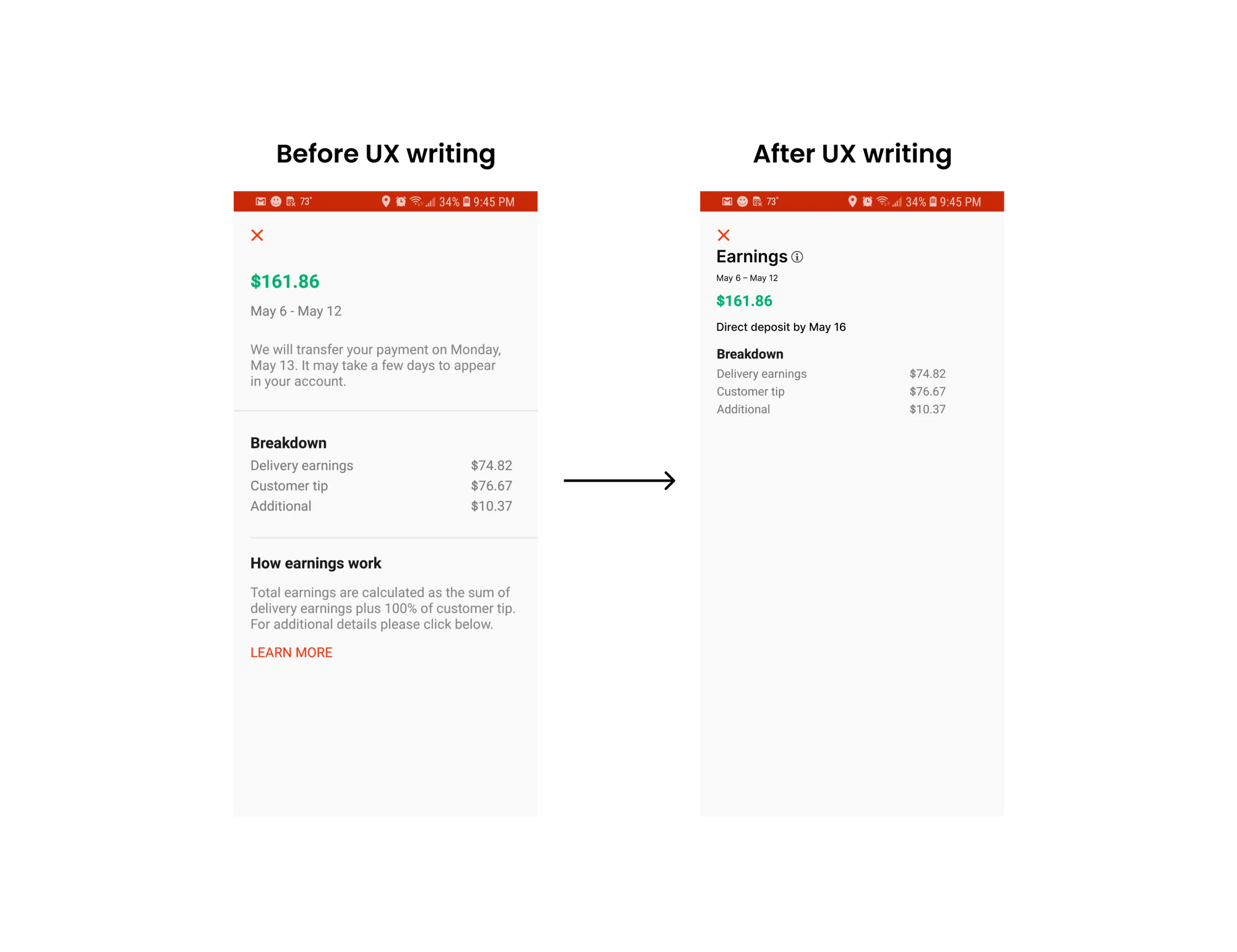
Before content design, the screen is pretty messy and hard to use. There’s a lot of information going on, and you can’t quickly pick out what the main point of the screen is.
With strategic content design, I consolidated the content in a few ways:
- With some light math, “We will transfer your payment on Monday, May 13. It may take a few days to appear in your account” can be translated to “Direct deposit by May 16.”
- “How earnings work” might not be applicable to everyone, so we can put that microcopy behind an information icon.
Content design is as much about adding in microcopy as it is taking it away. The after version reorganized the existing elements and added in new elements:
- By adding the header “Earnings,” someone can easily and quickly understand what the screen is showing them.
- By moving “May 6 – May 12” closer to “Earnings,” it’s more clear that’s the range of time the Earnings were earned within.
- By removing the line before “Breakdown,” someone can more clearly make the connection that that’s a breakdown of their earnings.
This is a simplified example of content design, and know there's strategy, research, collaboration, testing, and much more that goes into an official content design project, which we’ll dive into later on.
You might be thinking this is a pretty different kind of writing. That’s because content designers work together with product designers to design the structure, order, and layout of screens.
Content designers also write the words on a screen, but the difference is they also collaboratively control the arrangement of the screen.
Because of that control, content designers are able to think through the story the screen is telling, and that helps content designers write the actual words more easily.
Content designers are storytellers
But not the typical Steven King novella kind you’re thinking of.
Content designers tell stories in the same way you’d tell a story to a friend. Storytelling in content design is about creating a conversation between the product and the user.
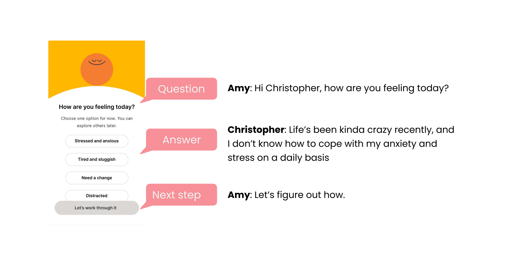
“Conversation” might sound a bit hokey, but it’s accurate. Take this onboarding screen from Headspace:
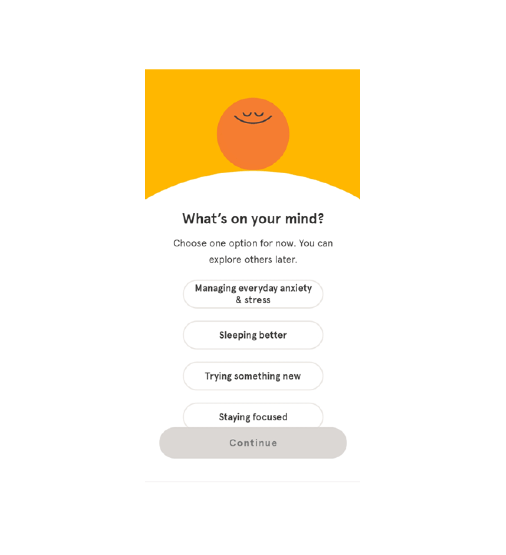
Seems pretty normal, right? Just your everyday app asking you some routine questions.
That’s true, but with our content design cap on, we can see the screen in a whole new way (that way being a conversation.)
Pretend with me for a moment that this screen is actually a conversation between Amy and Christopher:

Headlines, selections, and buttons aren’t just components — they’re communication vehicles.
The headline is Amy asking Christopher what’s on his mind. The selection options are how Christopher might respond. And the button, or call-to-action, is Amy being a normal human and continuing the conversation.
The super cool thing is the context, or someone’s relationship to the product, can change the tone of the conversation by a lot.
At this point, we don’t know who Amy and Christopher are to each other. Now, let’s pretend they're husband and wife:
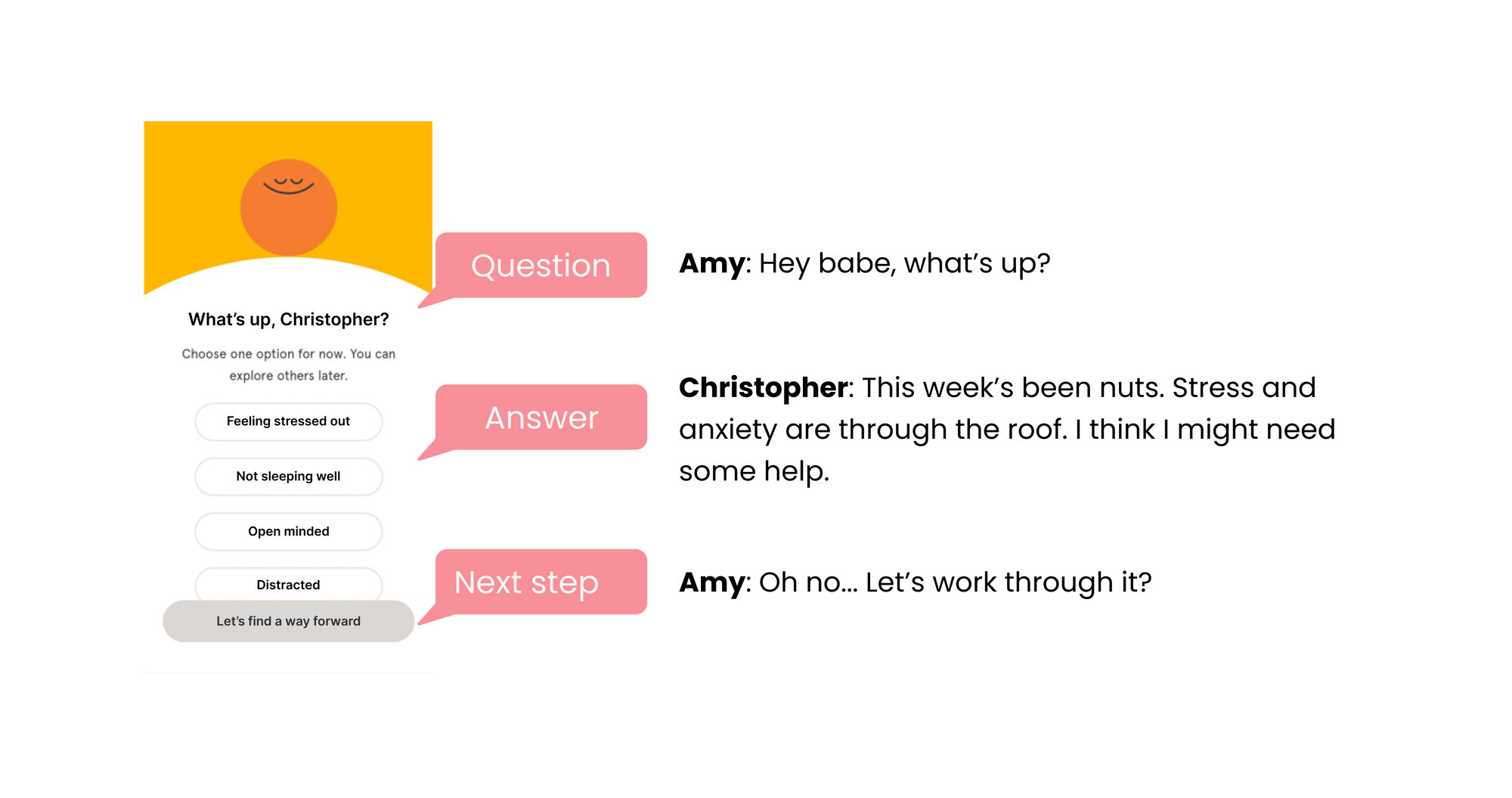
The conversation changes. It’s more casual and comfortable. It’s clear Amy and Christopher have their own language (using words like “babe”) that distinguishes them as a couple.
Now, imagine Amy and Christopher are therapist and patient:
As therapist and patient, Amy and Christopher’s relationship is the most formal. Their relationship is caring but transactional, and the language reflects that.
If you don’t know someone’s relationship to the product you’re designing, your content design is going to fall flat. That’s because content design is all about communication, and you’re not gonna talk to your grandma and your boss the same way.
A big component of storytelling is a product’s voice and tone. At a high level, a product’s voice and tone is its personality, characterized by how the product sounds at different moments in time.
Content design is about communicating solutions
Content designers are just big ‘ol problem solvers. We just use words, the organization of information, and stories to make solutions crystal-clear.
For example, say your debit card is declined because of insufficient funds. That’s a problem. The content designer helps solve that problem by writing error message copy that reads, “That account has insufficient funds. Try a new payment method.”
You might be thinking, “Why do you need a content designer for that? Can’t the engineer or designer just write the copy?”
While that’s technically true, when an engineer or designer writes the copy, you end up with an error message like this:
Which is much less clear, and the user has no instructions on how to course correct.
Content designers are trained on how to use words to create clear, concise, informative, and useful experiences, and that’s a needed complement to a designer or engineer’s skills.
Without a content designer onboard, a poorly written, dead-end error message gets shipped, and more users drop off, hurting product growth and sales.
Content designers are trained to think about every path a user can go down and how to communicate those paths, so user journeys, or paths users follow, are enjoyable and business goals are met.
When it comes to content design, problem-solving means:
- Not just how can I make this more clever, but also how can I make this more clear
- Not just how can I describe the experience, but also how can I simplify the experience
- Not just what do I write in the button, but also how do I motivate users to continue
- Not just how do I position us as the best solution, but also how do I help users find the best solution
That’s what content design is in a nutshell 🥜
Never thought I would use that emoji…
I hope this lesson added some clarity around what content design is and what content design isn’t.
Happy content designing 🖖


