Products exist to help users achieve something or accomplish a goal. But as per any journey, there are bumps in the road along the way. Those bumps are error messages.
An error message is a message that shows up to tell the user something went wrong and needs to be corrected.
Here’s an example:
There are 5 instances when an error message shows up:
- You entered something incorrectly
- You left something out
- A problem happened when trying to process whatever you were trying to do
- You need to change something to move forward
- You found something that doesn’t exist anymore
Here’s an example of each:
1. You entered something incorrectly
In this example from Dropbox, the user got an error message because they formatted their email incorrectly:
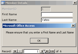
2. You left something out
In this example from Microsoft, the user got an error message because they didn't include their first and last name:
3. A problem happened when trying to process whatever you were trying to do
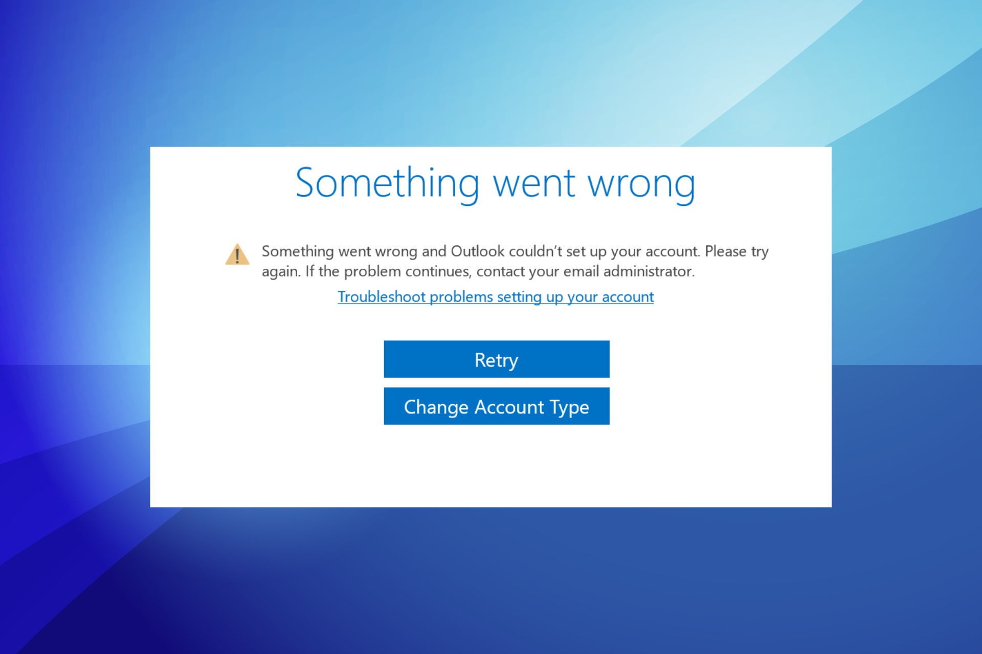
In this error message, something went wrong when the user was trying to set up their Outlook account:
4. You need to change something to move forward
In this error message from Google, the user needs to make a change to their internet connection to use Google search:
Similarly, in this error message from Spotify, the user needs to adjust their payment details to continue using Premium:
5. You found something that doesn’t exist anymore
In this error message from Path, the user landed on a page that doesn’t exist:
Why do error messages matter?
Imagine you’re going on a cross-country road trip from California to New York. You have no map (just go with me here,) and you’re relying on road signs to point you in the right direction. To make sure you get to New York safe and sound, you have to vigilantly pay attention to those road signs.
Now, imagine you miss one, and instead of going through Oklahoma, you go through the New Mexico desert. There’s no sign to point you back on track, just one that lists some highway you don’t know, and you don’t have a map.
It’s pretty much a dead end, and you can either risk it and drive into the unknown or turn around and go back home.
Now, imagine instead there’s a road sign that points you north, south, or west:
You know you need to go north again, and this sign helps you course correct, get back on track, and eventually reach New York.
A good error message is like a helpful road sign — it helps you recognize and identify an error and gives you the information you need to resolve it and get back on track.
Without helpful error messages, like in our road trip example, users abandon course, and sometimes they never come back. By keeping users on track, error messages ensure a smooth-sailin’ user experience, which keeps users around, and makes it easier for them to accomplish their goal and get on with their day.
What makes error messages effective?
Effective error messages:
- Say what happened and why
- Provide reassurance
- Help users fix it
- Always give a way out
Effective error messages say what happened and why
Imagine you’re going on a date you’re super pumped about. You get all dolled up, get to the restaurant 5 minutes early, and eagerly await the love of your life (?)
5 minutes pass. Then 10. Then 20. You got stood up with no text or call to explain what happened or why. And that’s pretty painful.
While it doesn’t necessarily tug at your heart strings, the same concept is true for error messages. If you don’t explain what happened or why, the user is gonna be left hanging, frustrated, and left with no option except to abort the mission.
To avoid leaving the user hanging, explain why the user got an error, even if the only explanation is that there was a technical issue.
Never blame the user, even if it was their fault. As a default, say something like “an issue on our end,” and if you have the space, reiterate it’s not the user’s fault.
Throughout this section, we’re going to build an effective error message. Starting with how to say what happened and why:
In this example, the user couldn’t create an account. We assume responsibility for it, and we clearly explain what happened (we couldn't create the account) and why (a technical issue on our end.)
Effective error messages provide reassurance
Let’s go back to the date example. Now, instead of flat-out standing us up, the date sent us a text that they’re running later (aka, they explained what happened and why.) Fast-forward 20 minutes, and we haven’t heard anything else, and we’re starting to wonder if the text is still true.
Now, instead, imagine the date texted us 10 minutes into our wait saying something like, “My train is delayed, but I’m still on my way :).” That reassurance lets us finally exhale (and continue to wait in anticipation.)
The same is true for error messages. If you can provide reassurance that everything is still OK, you let the user rest easy and not worry if something got erased, or they lost all their progress.
It’s important to put the reassurance first, so the user gets peace of mind immediately.
Adding on to our create account error message example, here’s what it looks like to also provide reassurance:
By saying “your progress was saved,” the user can wipe away any worries of lost effort.
Effective error messages help users fix it
Back to our fictitious date, that’s off to a rather poor start — now we know their train is late, but we’re just supposed to sit there until they arrive, which can be… awkward. Do you order something? Should you give up the table? You can only look busy for so long.
Now, imagine our date was a little more helpful and added to their last text something like, “My train is delayed, but I’m still on my way :) Feel free to order a drink in the meantime. I shouldn’t be more than 15 more minutes.”
With that extra clarity, you can feel OK about ordering a drink without them, which solves your problem of brushing off the wait staff for the fifth time and feeling awkward hogging a table.
The same is true for error messages — if there’s a way to fix the problem, tell the user exactly what to do. This helps break the dead end and helps them continue to make progress.
Adding on to our create account error message example, here’s what it looks like to also help the user fix the problem:
By instructing the user to hit “create account” again, we’re clearly telling them how to solve the problem. Without that helpful direction, the user is left to fend for a solution on their own, and that’s not what we want as helpful product builders.
Effective error messages always give users a way out
Ok — it’s been 15 minutes, and our date still isn’t there. You’re almost done with your drink, and you’re wondering what to do next. Order another one? Leave?
Then, you get another text from the date: “I’m so sorry. I’m still on the train. I’ll probably be at least 15 more minutes. I feel bad having you sit there. If you want to reschedule, I totally understand.”
By giving you an option to reschedule, our date has given us a way out, so we’re not trapped at a restaurant for an unforeseen amount of time.
The same is true for, you guessed it, error messages. If the user can’t solve the problem on their own, don’t trap them — give them a way out. The best way to do that is to give the user a way to contact customer support.
Adding on to our create account error message example, here’s what it looks like to also give the user a way out:
What makes error messages ineffective?
On the flip side, ineffective error messages:
- Use an insensitive tone
- Pass blame
- Use technical jargon
- Are generic
Ineffective error messages use an insensitive tone
Imagine a doctor performing a procedure and suddenly saying, “Oops! Something went wrong…” That’s the last thing anyone wants to hear when the stakes are high, whether it’s surgery or processing a payment.
Error messages are not the time to be cute, clever, or fluffy. Instead, we want to show users we know it’s serious, and we understand it’s important to them.
Similarly to what we did in what makes effective error messages, we’re going to build an ineffective error message for the same topic, creating an account, starting with an insensitive tone:
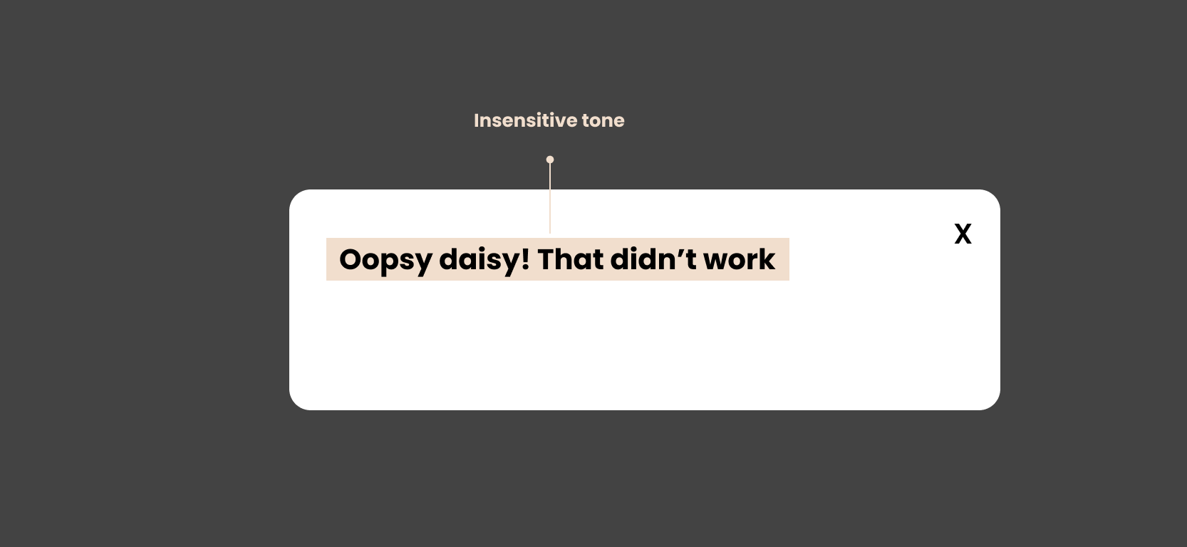
Saying “oopsy daisy” doesn’t instill a lot of confidence. It makes it sound like we, as the product builders, are making light of a situation that isn’t light-hearted. Instead, we want to communicate with the user that this isn’t a light matter, and we’re serious about helping them find a solution, no matter the situation.
Ineffective error messages pass blame
Imagine that same surgery, and after the doctor said “oopsy,” they blamed you for the mess-up because you moved. Doesn’t exactly make you a big fan of the doctor. You didn't mean to move, and now you feel bad about it, and the stakes feel even higher.
Instead of focusing on the action that led to the problem, focus on the problem. We don’t want to shame users or external parties, even if something they did is why they got an error message.
Adding on to our create account ineffective error message example, here’s what it looks like to also pass blame:
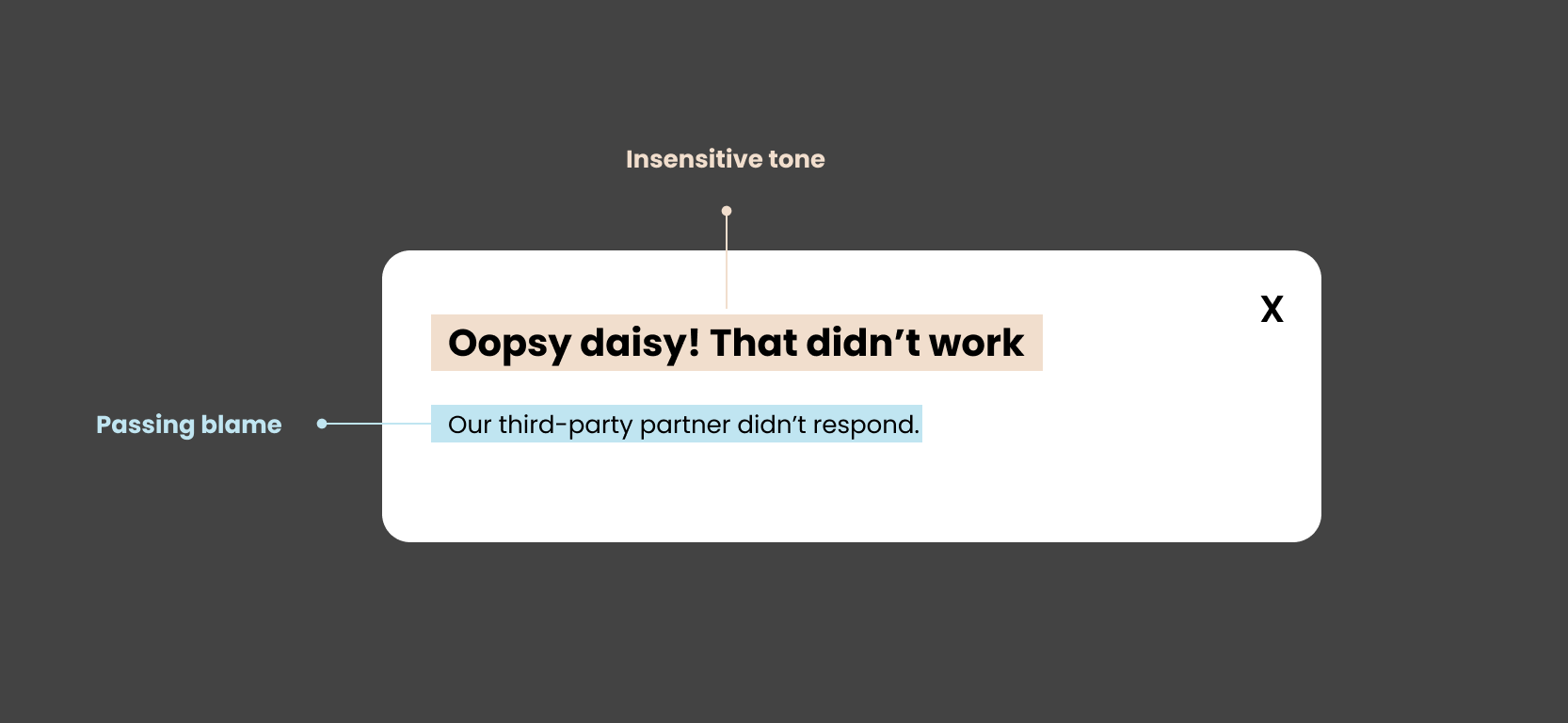
The user doesn’t need to know we have a third party involved. That doesn’t solve anything, and instead, makes us look petty. Again, instead, don’t dwell on the action — focus on the problem and how to solve it.
Ineffective error messages use technical jargon
Even in today’s world of user-centered design, technical jargon still sneaks its way into error messages.
Data? Credentials? Users? Authentication? Umm… what?
This technical stuff is not important to the user — they just want to know what went wrong and how to fix it.
Adding on to our create account ineffective error message example, here’s what it looks like to also include technical jargon:
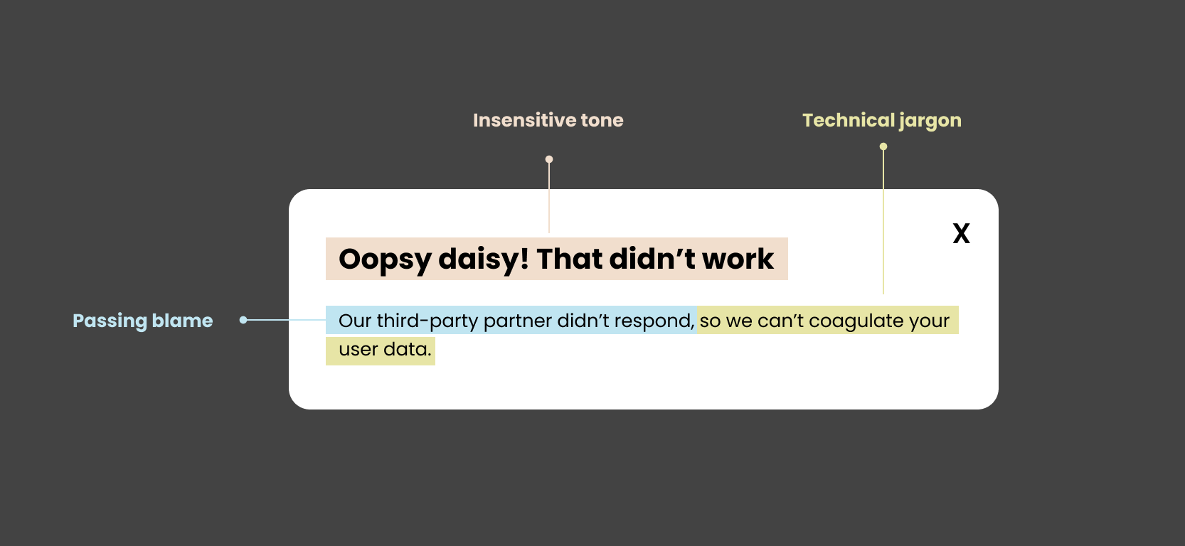
“Coagulate your user data” is not language 99% of people would use. Even though the topic might be technical, we still need to write accessibly and at our user’s reading level. Don’t alienate users with jargon, and instead, find the plain language version of what you’re trying to say.
For example, here, you could say, “we can’t process information to create your account,” instead.
Ineffective error messages are generic
Sometimes we don’t know what caused the error, but sometimes we do.
If we know what caused it, and we don’t tell the user, we’re doing our users the ultimate disservice.
For example, adding on to our create account ineffective error message example, here’s what it looks like to be generic:
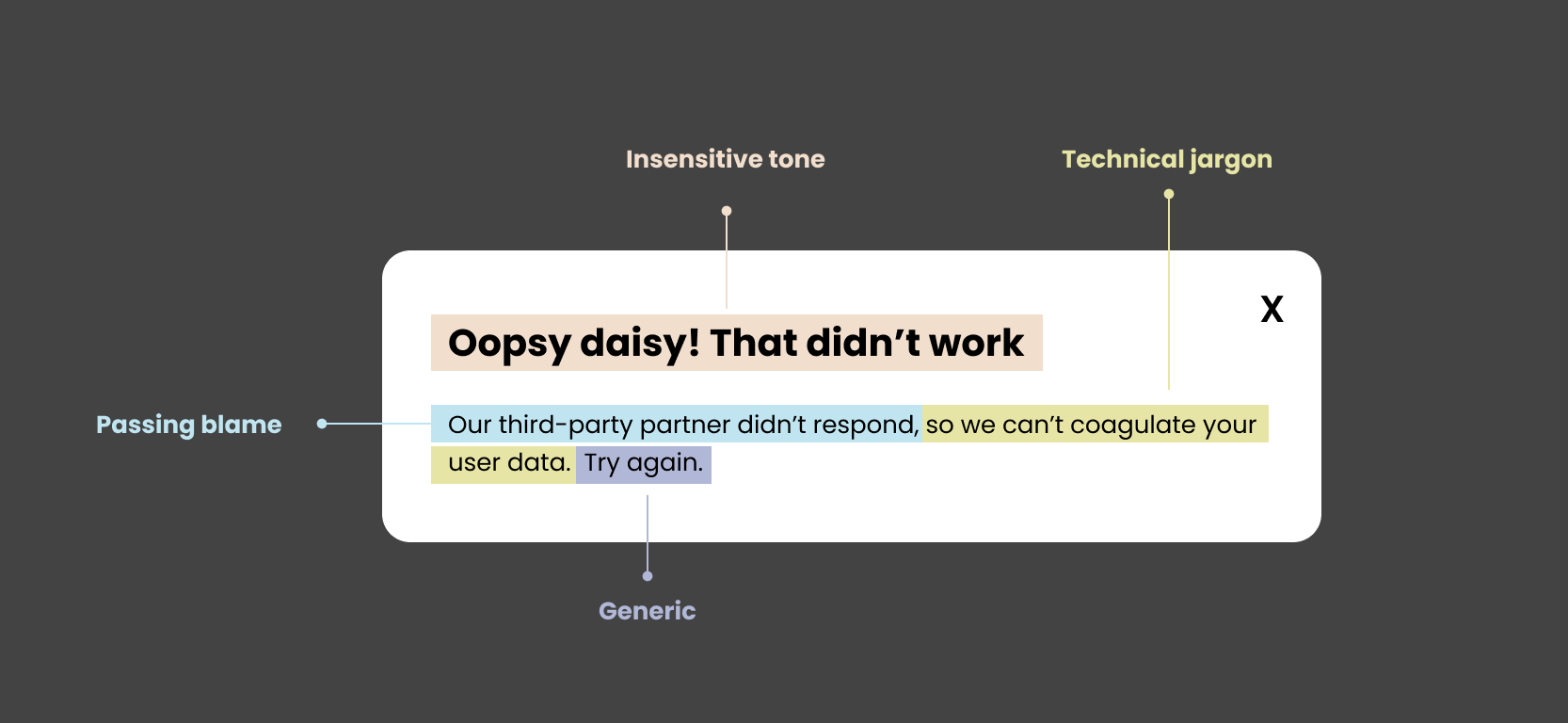
If we know a specific action the user can take to resolve the error, say it. “Try again” is only helpful if there’s nothing else they can do, which is the case sometimes. A good rule of thumb is to be as specific as possible, and scale the specificity based on your knowledge of the cause.
Good examples of error messages
Netflix
Netflix’s error message here is clear and concise. You can understand what’s happening, why, and what to do in a glance. This is an excellent example of how to say a lot with a little.
Hootsuite
In this 404 page, Hootsuite succeeds at explaining every reason why a user could land here, providing a solid sense of clarity. This is also an example of an OK way to infuse voice & tone. Since the stakes are quite low here, adding some personality makes this wrong turn a little lighter. They end with a way out, making it clearly actionable, too.
Bad examples of error messages
Bitly
Nope, try re-writing this error message, Bitly. Bitly gives the user no insight into, well, anything. You don’t know what went wrong, why, or how to fix it, and they’re pretty sassy about it.
Happy UX writing 🖖


